
Story By Jenn Gidman
Images By Greg Piazza
No run-of-the-mill exteriors for Greg Piazza, who uses his Tamron SP 150-600mm VC G2 lens to create artistic images.
Architecture Made Abstract
When you first spot one of Greg Piazza’s architectural photos, don’t be surprised if you mistake it for a painting. “Many people do,” says the Dallas-area photographer, whose abstract paintings are inspired by many of the architectural photographs he takes. “I’m interested in architecture and the emotions it can provide. I like to examine each line and angle and how changes in light and shadows affect them over time.”
Because this kind of imagery involves strolling around city streets to scout for subjects, with minimal human contact, Greg has been able to keep his creative juices flowing during the pandemic. “It’s been wonderful to get out of the house after a day filled with Zoom calls,” he says. “I’ve started a project entitled ‘Things Aren’t as Smooth as They Seem,’ where I’ve been focusing on reflections and the little waves you sometimes get in those reflections, as a representation of what’s going on in the world right now. Other than that, I’m still continuing my usual focus on high-contrast architectural photos with an emphasis on color, shapes, and patterns.”
For his newest work, Greg has been using the Tamron SP 150-600mm VC G2 lens, which offers him the focal-length versatility, crispness, and vibrancy he needs to create eye-catching abstracts. “This lens produces amazing color rendering, which is important for the type of work I’m doing,” he says. “And because I’m shooting all handheld, the Vibration Compensation feature on this lens is critical—it helps keep blurring from camera shake to a minimum, ensuring my pictures are always sharp.”
Read on for a short explainer of what drew Greg’s eye to each of the photos featured here, including what inspired the names for many of them.
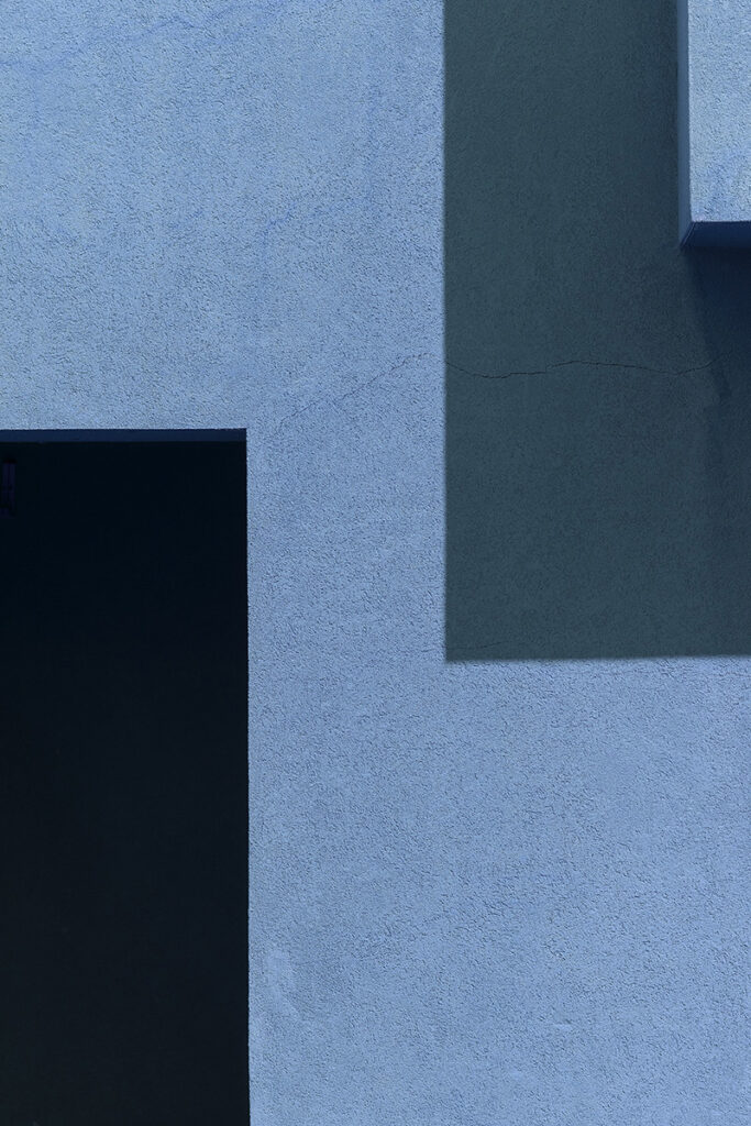
This photo was taken at the Santa Fe University of Art and Design. The challenge in this shot was making sure I was able to capture that smaller, light-blue piece in the upper-right corner, which adds some depth to the image—otherwise the photo would have looked rather flat. I was able to get the image exactly how I wanted from where I was standing by shooting at 150mm.

This photo was taken here in Dallas, not far from my home. The sun was going down, which gave me that warmer glow in the panel on the left with the reflection. Instead of taking a picture of this scene from the street, I had to climb to the top of a nearby parking garage to get my perspective just right, and to show the two contrasting panels the way I wanted to. I was about two blocks away, so I used the full reach of the lens and shot the picture at 600mm.
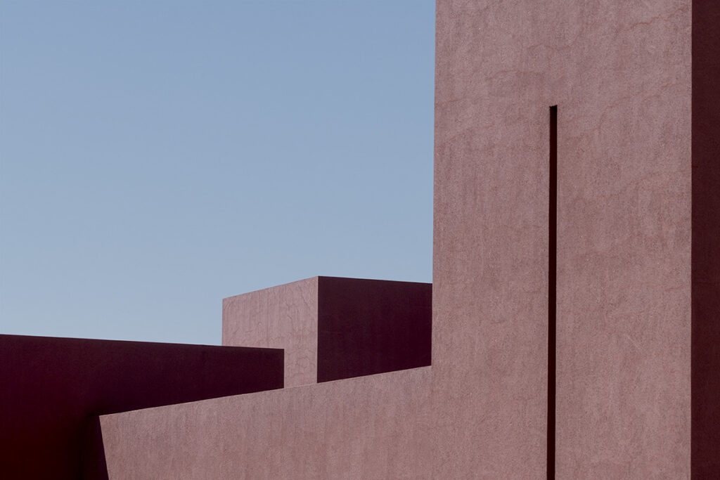
This is back at the university in Santa Fe. I wanted to show the relationship of the different buildings to each other. At first glance, these structures look like they’re all connected, but they’re actually quite far apart: The one with the vertical line down its center is at the front of the campus, while the building in the back is in the distance. I like creating images that show an altered perspective that differs from reality.
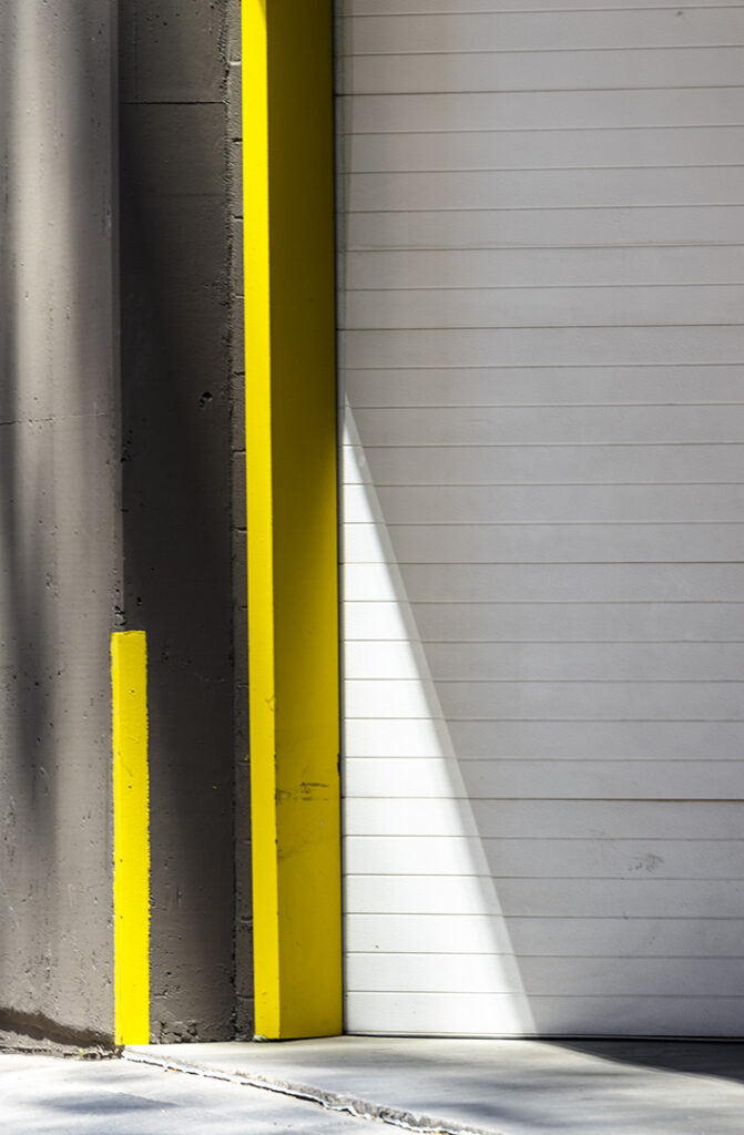
My wife and I were in downtown Denver for a few days, which gave me a whole new city to explore. I wasn’t sure what I was going to find, but I spotted this scene while we were heading back to the hotel one afternoon. What stood out to me was that swath of white on the side of the yellow vertical lines. The shadows created some interesting shapes and contrasts, too—the concept of light versus darkness always appeals to me.
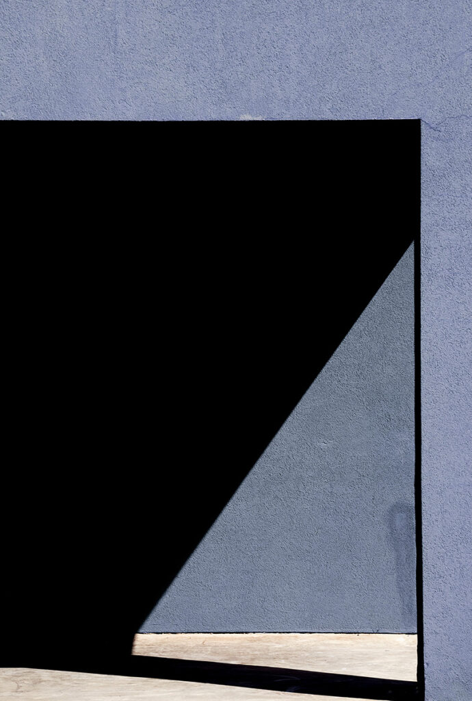
I started to create art when my brother died. Since then, I’ve worked on a project featuring a series of photos in which it looks like you’re approaching a doorway, and on the other side is light and darkness, like I mentioned in the previous image. This scene back at the university seemed perfect to fit into that theme, which actually seems to infiltrate much of my work.

The geometry present in this image really caught my eye. This one really looks like an abstract painting. The shadow from the building gave me the depth I was looking to incorporate into the photo.
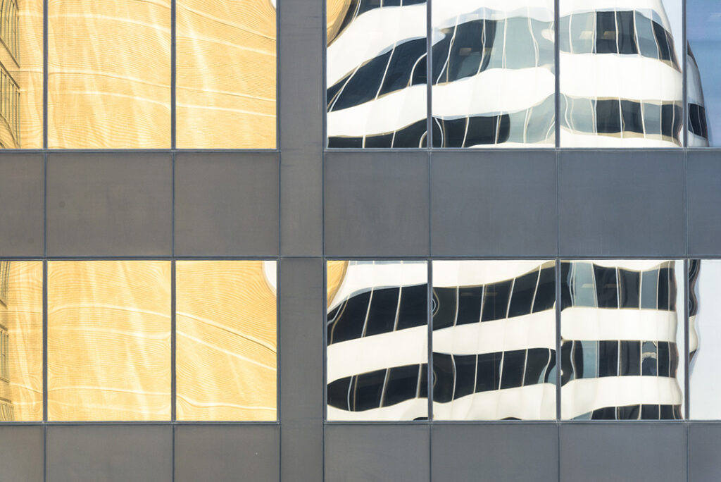
My wife and I were wandering around, checking out different buildings, when we spotted this hotel. I loved the gray lines, as well as the grid structure, the yellow opposite the white, and the reflection. Once again, people have told me that when they first saw this photo, they thought it was a painting. I think that speaks to the detail that this lens is capable of.
To see more of Greg Piazza’s work, go to www.gallery7nine.com.